American Legion and Google web fonts

This week I did a little work for a local post of the American Legion Post 491. I am in the beginning stages with the client but thought appropriate to talk about right before Veterans Day tomorrow. This is the first time I have actually used Google web fonts. The welcome red header on this page and the subhead (H2) is provided by google web fonts. They have a pretty large variety of fonts you can choose from. I wanted to go this route because I wanted to match as close as possible the image header on the top of the page and yet still make this site so someone else can edit the text without needing to update an image file.

American Legion ost 491

The font I was trying to match was Trajan and the closest I could find was Mate SC on google. It’s pretty simple browse their collection and then to copy the code and add it to your style sheet. I then added a little bit of drop shadow in CSS and transformed it to upper case for the H1 and regular for H1 through H6 for the rest.

The way you add a shadow in CSS is this little line of code:
text-shadow: 4px 4px 4px #CCC;

The first number is the X-offset, the second is the Y-offset, the third is the amount of blur for the shadow and the last three letters with the pound symbol is the color of the shadow.

I have found that the text shadow doesn’t work in all browsers. It just doesn’t show so at least it degrades nicely and doesn’t render it unreadable.

Hope to use Google fonts and CSS font styling more!

Yosemite Fall Colors

I haven’t been to Yosemite when there was so much color before. Below is my attempt to capture some of that color but it’s nothing compared the real thing as the light streamed down and caught itself on the yellow leaves throughout the forest. This year I have managed to get to Yosemite at least once during every season and each trip held something new to see. A meadow that was dormant the previous time is awake with flowers the next. Or a tree that was lush with leaves that is now covered in fluffy seed pods. It’s a wonderful thing to experience when you stop to look, listen and experience.

Burning Bush
Remains
House in the wild wood
Our campsite
Panorama (click to enlarge)


How to draw a vector-based jack o’lantern in Photoshop with shape layers

How to draw a vector-based jack o’lantern in Photoshop with shape layers

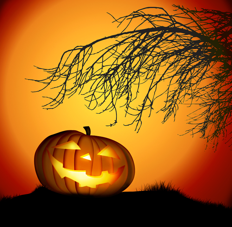
Happy Pumpkin!

Since it’s season appropriate I thought I would share what I taught my photoshop class on how to make a Jack o’lantern using the pen tool and shape layers.

Below is what the final image looks like that for the most part would scalable as a vector based graphic before I turned it into a bitmaped image for display purposes here.

[button link=”http://www.eloine.com/ex/finalWpumpkin.psd” color=”orange”] Download layered PSD[/button]
vector based pumpkin

Start with a outline of what you want to do. Below is the sketch I started with and took a picture with my cell phone to get it into Photoshop.

Then select the pen tool and make sure the first icon for shape layer is selected. Then I traced around the outside of pumpkin and made sure my fill color was a dark orange. I used #964b09

To get the shadow effect I click the layer Fx button at the bottom of the layers palette and select inner shadow and make sure your settings look pretty close to mine. (Click image to make bigger)

Duplicate this layer to make a copy of your shape you just made and then go to  Edit > Free Transform Path.  This will make a bounding box around your duplicated object. Use your mouse and click and drag in from the left and the right to shrink the second oval. Repeat the process until you get to the center of the pumpkin.

You should have something close to the image below. If some of the shapes don’t look right just use the pen tool and then press  your control key and make sure your curser looks like a hollow arrow (called the direct selection tool). Then touch the edge of the path you created to activate the control points that you can move or bend.

After you are satisfied turn off all the layers that are the pumpkin so you can see the sketch and make a new layer above layers of the pumpkin and name it “face”

Using the shape tool outline the pumpkin eyes, not and mouth and make sure your fill color is white. Then duplicate my settings below for  the inner shadow replicate my settings by using this color #812c03 (Click image to make bigger)


For the gradient overlay your going to create a custom gradient with the colors #fff4c5, #ffdd4d and #6c1501 (Click image to make bigger)


After you finish with the pumpkin and it’s face don’t forget to make a little shape for the stem and put that on the layer beneath everything else.

When all done group all your layers together by clicking the folder icon at the base of the layers panel and dragging the layers in there. This is so you can flip or transform or apply various options to all the layers at once.

I made a new file and then applied a radial gradient of an orange yellow to a very dark orange for the glowing sun or moon or whatever that is. Then with the pen tool I made a shape filled with black that the pumpkin would sit on.


Below is the pumpkin with a new layer on top with the blend mode set to overlay and using a soft white brush I painted in some glow and then a black brush I painted in some shadows.


When I turn off all the layers but the one mentioned above you can see what I did to create the glow and shadow over the transparent area represented by the dark checkerboard pattern.

Lastly I thought this image needed a spooky tree. I could have drawn it but being the Fall it was so much easier just to shoot a picture of a barren old branch.


I then went to image > color range  and shift + clicked  areas of the sky to make a selection of everything else but the branches. (click image to make larger)


I then when to select > inverse  selection to select only the branches. I pasted that into Adobe Illustrator and then told it to trance the image. I could have done that with Photoshop but it takes up a lot of RAM because it’s not as clean a trace. The other option would be just to fill this area with solid black to make a silhouette and that would have achieved the same appearance. It just wouldn’t have been scalable. That is an option though if you don’t have Adobe Illustrator.

Next just choose the blend mode of darken  to make sure none of the white shows over the orange sky and only the black.


Lastly I used brush number 134 and varied it’s size, scatter  and turned off color dynamics in brush presets to make the black grass.

I hope you enjoyed the tutorial and can find it useful when making other things!

Being different is beautiful

Freak of nature or just a survivor?

I have a stand of cattails growing beside my garden that I have blogged about in the past. They are just getting ready to blow their seeds and yesterday I noticed one really irregular looking cattail. As I came in for a closer look I realized it was one cattail that had split at the base and had somehow managed to join back together at the top. I can’t really figure out how this happened but in the process it now has three seed heads! To me it looks kinda like a cinnamon twist and was so beautiful I just had to try and preserve it and photograph it.

Being different can be beautiful!
split cattail
Split cattail makes three

Welcome to the party!

Relaxing after a meal (click above to enlarge)

I can’t help it. I think these birds are neat. They are called the New World Vulture and they are what naturally clean up our streets and fields when an animal dies. A friend of mind said these animals look mean. Perhaps if your only association with them is death then I can see how you can think that. If you think about it though they don’t kill so they can’t really be mean. They just clean up what’s left. These birds were eating the remains of some rabbit on the street when I slowly ventured near with my camera. As I came close they wondered if I was a predator – after all I was pointing a long gun like thing so who could blame them! As I crept closer I noticed how each bird looked out after the other. They didn’t fight over the tiny little rabbit. They just quietly ate and then backed away as another would share in the meager rode kill.


I’ll end with something on the other end of the size scale and perhaps a lot more mean 😉