Google drive forms

I’ve posted before about Google docs (now called Google drive) but I had to post again because they sure have made my life so much easier!

Doing web forms from scratch can be a time consuming process to make and with Google’s easy form creation tool you can have a working feedback form that collects data in a spreadsheet in a matter of minutes for free!

The draw back is you don’t have a lot of control over the placement of some of the fields. For example if you want to make your form two column you have to get back into trying to do some code hacks so you might as well do another method than Google forms.

You can however control the width of the form that you can then embed in your web page. What I have done here is dress it up with one of my photos. This helps make the web page not so boring with a static form. Make a form and assign it the width of half the page and then drop an image behind either in a table background or as a background DIV tag and you’re done!


form1

Read more

New website launched

home

tiny

Here is a website that I assembled along with design direction from my designer friend John Schall who created the label art. I really like the use of stock photography on this site. The combination of beautiful models and herb photography gives the site a very earthy feel. I utilized CSS gradients in the background of the support pages decreasing the load time of the heavy graphic intensive designs. You can view the site at Lakoet.


Christmas Glyphs and iPad Fun

Ok so this is not a work of art but it sure was fun and there is a potential to do so much more with this app. It’s called iFontMaker and it’s available for both the ipad and the iphone.

Do you need a custom font for a design project? Do you need a webfont that is scalable on a browser? Then give this a whirl during the break.

It’s really pretty simple – there are hints as to where the font character might be be it serif or san serif typeface and you either trace it with a calligraphic style brush or a blunt brush. I chose here to just make little Christmas style dingbats as much as I could think of and then publish that.

When you’re done with the alphabet both upper and lower as well as numbers and other characters you can publish the font and they will turn it into a system font for you as well as a web font that you can use on your web pages. Here is a link to mine! Above I opened it in Adobe Illustrator – I can scale it type with it and apply colors to it as well as continually edit it if I wish. Pretty cool huh?

If you need to make a custom font for someone this app makes it pretty easy to create one!


Magnify an image

I ran across this jquery plugin to magnify an image. I needed to put a map on a page that I felt was a little small for the detail it had. This plugin allows the mouse over to actually load a larger image in place of it without destroying your layout.

[button link=”http://www.losmedanos.edu/construction/pathways.asp” newwindow=”yes”] Demo[/button]

[button link=”http://mlens.musings.it/” color=”green” newwindow=”yes”] Download[/button]


Special icons attached to special links

Special icons attached to special links

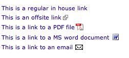
I thought I would share a little tip that just makes getting around sites easier and easier for the web content creator to maintain. If you find you have a lot of external sites you are linking to or links to PDFs it’s good practice to somehow tell people that information before they click. Otherwise they may download something they didn’t want to or are trying to find a way to get back to where they came from. It’s been considered good practice to add (PDF) or (DOC) at the end of a link but not everyone does it when you have multiple authors or they do it inconstantly with lower and upper case.


The code below shows how to add an external link icon and a special link icon if it’s a secure site or if it’s an email address. Note the code changes a little for when it’s a file type like a .DOC or a .PDF. You must also tell the CSS as in the example here how big your icon is so it doesn’t overlap the text. The very last part is important to tell the browser that if it isn’t any of these special things just leave it blank.

Here is an example link where this college needed a list of scholarships available. The inhouse links are for scholarships administered by the college but the ones with the icons are outside links that they are not responsible for. By doing the code below no modification to the HTML is necessary. The browser will read the CSS and figure out how to display the link.

#middlecol a[href^="http://"] {
    background: url(https://www.yourdomain.com/images/external.png) 
    center right no-repeat;
    padding-right: 13px;
}

#middlecol a[href^="https://"] {
    background: url(https://www.yourdomain.com/images/external.png) 
    center right no-repeat;
    padding-right: 13px;
}

#middlecol a[href^="mailto:"] {
    background: url(https://www.yourdomain.com/images/email.gif) 
    center right no-repeat;
    padding-right: 20px;
}


#middlecol a[href$='.pdf'] {
    background: url(https://www.yourdomain.com/PDFs/pdficon.gif) 
    center right no-repeat;
    padding-right: 20px;
	line-height:20px;

}

#middlecol a[href$='.doc'] {
    background: url(https://www.yourdomain.com/images/wordicon.gif) 
    center right no-repeat;
    padding-right: 20px;
	line-height:20px;

}

#middlecol a[href$='.docx'] {
    background: url(https://www.yourdomain.com/images/wordicon.gif) 
    center right no-repeat;
    padding-right: 20px;
    line-height:20px;

}

#middlecol a[href^="http://www.yourdomain.com"]  {
    background: none;
    padding-right: 0;
}