Category: Web Tips
-
Another Site Launched
Just finishing up a website for Julie Arbuckle a legal resolution expert for the Napa Valley. She is a Mediator, Arbitrator and Evaluator who resolves a wide array of disputes and many different types of litigated cases. Read her resume here. My designer friend John Schall developed the logo and the branding of this site and…
-
Pet website in progress
Here is a website I’ve been working on. Below is a screenshot of the home page mockup and one support page along with a rough logo composition. The idea of the site is to pair breeders and buyers with dogs that make good companion pets. Not all shelter dogs fit this description and there is…
-
What the font?
Have to share this cool little browser button that identifies what fonts are being used on a web page. Not only does it show the name of the font but also the size and weight of the font. Get it from the website fount.artequalswork
-
New website for Quantum Wine Cellars
Just finished assembling a site for Quantum Wine Cellars . I had the pleasure of attending their release reception this last weekend and to sample their wonderful wines. Please browse their site to learn more about Quantum’s wines and their process. John Schall of John Schall Design designed the logo and the overall look of this…
-

Design process for building an interactive map
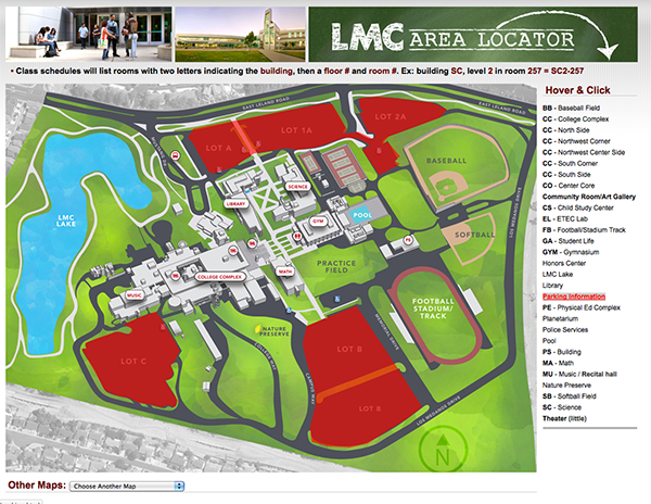
This isn’t really a tutorial of how to create an interactive map as this blog post would be way too long and too complex. It’s more about the process of taking various resources and putting them together to create something. As I write this post this map is a work in progress. View Demo The…
-
Google drive forms
I’ve posted before about Google docs (now called Google drive) but I had to post again because they sure have made my life so much easier! Doing web forms from scratch can be a time consuming process to make and with Google’s easy form creation tool you can have a working feedback form that collects…
-
Easy website background changer
Here is a nifty web plugin I have to share. Ever want to see what Google would look like not being white?