Design process for building an interactive map

Design process for building an interactive map

This isn’t really a tutorial of how to create an interactive map as this blog post would be way too long and too complex. It’s more about the process of taking various resources and putting them together to create something. As I write this post this map is a work in progress. View Demo

The first step was to create the map. This was mostly done taking a screen grab from a satellite view of our campus off of Google maps. Then the buildings were traced using the pen too for each panel and curve. Shading was applied to give the buildings a 3D look.

header

For masthead where the text looks like chalkboard type I used the rough texture of paper overlay into white type. I then outlined the type and the arrow that I drew with a rough brush.

The map below is using several different technologies.

  • Image maps to make hot regions using Adobe Dreamweaver to define the coordinates on mouse hover.

map1 Read more

Flag wrapped gun with displace filter

Flag wrapped gun with displace filter

Ok so this is not my usual cute little fluffy kitten or flowers photo. I assure you there are more of those to come!

For now the pressing issue of the day seems to be guns and violence. Not making a stand either way on that issue but as a graphic designer you have to illustrate anything. Here is a little web banner I had to whip out for a college debate on the subject.

My idea was rather typical but often typical gets the point across of what is really at the heart of the issue: the constitution and our rights as US citizens. What better symbols than a gun (duh!), the constitution and the US flag?

I could have just made a collage of all three symbols but just to make it a little more eye catching I decided to merge the two with a very old Photoshop trick.

I still don’t know a better way to do this but if you do please feel free to share. For now though here is how I do it using the displace filter.

Start with good black and white image that you want to wrap that has lots of contrast: Read more

Lady bug revisited

Lady bug revisited

Sometime ago I wrote a post on how to draw a cute little ladybug. I was pleased when I found out someone a halfway around the world in Australia was trying it out. Anthony Cerra emailed me to show me his creation that I thought was just too adorable not to post!

If you want to check out some of his work visit his site here.

He said he was going to use it as the logo for some kids clothing called Two little bugs 🙂

LadybugLogo2

Special icons attached to special links

Special icons attached to special links

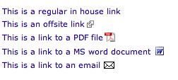
I thought I would share a little tip that just makes getting around sites easier and easier for the web content creator to maintain. If you find you have a lot of external sites you are linking to or links to PDFs it’s good practice to somehow tell people that information before they click. Otherwise they may download something they didn’t want to or are trying to find a way to get back to where they came from. It’s been considered good practice to add (PDF) or (DOC) at the end of a link but not everyone does it when you have multiple authors or they do it inconstantly with lower and upper case.


The code below shows how to add an external link icon and a special link icon if it’s a secure site or if it’s an email address. Note the code changes a little for when it’s a file type like a .DOC or a .PDF. You must also tell the CSS as in the example here how big your icon is so it doesn’t overlap the text. The very last part is important to tell the browser that if it isn’t any of these special things just leave it blank.

Here is an example link where this college needed a list of scholarships available. The inhouse links are for scholarships administered by the college but the ones with the icons are outside links that they are not responsible for. By doing the code below no modification to the HTML is necessary. The browser will read the CSS and figure out how to display the link.

#middlecol a[href^="http://"] {
    background: url(https://www.yourdomain.com/images/external.png) 
    center right no-repeat;
    padding-right: 13px;
}

#middlecol a[href^="https://"] {
    background: url(https://www.yourdomain.com/images/external.png) 
    center right no-repeat;
    padding-right: 13px;
}

#middlecol a[href^="mailto:"] {
    background: url(https://www.yourdomain.com/images/email.gif) 
    center right no-repeat;
    padding-right: 20px;
}


#middlecol a[href$='.pdf'] {
    background: url(https://www.yourdomain.com/PDFs/pdficon.gif) 
    center right no-repeat;
    padding-right: 20px;
	line-height:20px;

}

#middlecol a[href$='.doc'] {
    background: url(https://www.yourdomain.com/images/wordicon.gif) 
    center right no-repeat;
    padding-right: 20px;
	line-height:20px;

}

#middlecol a[href$='.docx'] {
    background: url(https://www.yourdomain.com/images/wordicon.gif) 
    center right no-repeat;
    padding-right: 20px;
    line-height:20px;

}

#middlecol a[href^="http://www.yourdomain.com"]  {
    background: none;
    padding-right: 0;
}

How to extract an image with hair

How to extract an image with hair

PSCS5 tip

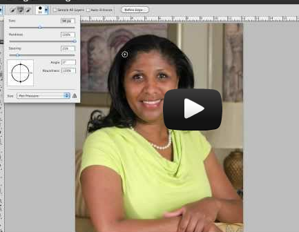
Today I gave a little 30 minutes talk at REI for our local camera club I found on meetup.com 

This post is a recap of my talk for those who would like to try extracting an image with hair using photoshop CS5 and the steps written below. Please let me know if you have any questions about the process or would like me to explain anything further.

Read more

How to alternate table row colors

Just had to share a snippit. I have been trying to alternate row colors globally and haven’t had luck in IE with this bit of CSS

tr:nth-child(even) {
    background-color: #ccc;
}

It doesn’t work in most IE browsers and then I found this bit of jQuery and it seems to work like a charm!

$(document).ready(function()
{
  $("tr:even").css("background-color", "#ccc");
});

[button link=”http://www.losmedanos.edu/directory/” color=”orange”] Check it out[/button]