Ok so this is not my usual cute little fluffy kitten or flowers photo. I assure you there are more of those to come!
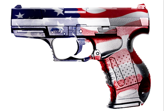
For now the pressing issue of the day seems to be guns and violence. Not making a stand either way on that issue but as a graphic designer you have to illustrate anything. Here is a little web banner I had to whip out for a college debate on the subject.
My idea was rather typical but often typical gets the point across of what is really at the heart of the issue: the constitution and our rights as US citizens. What better symbols than a gun (duh!), the constitution and the US flag?
I could have just made a collage of all three symbols but just to make it a little more eye catching I decided to merge the two with a very old Photoshop trick.
I still don’t know a better way to do this but if you do please feel free to share. For now though here is how I do it using the displace filter.
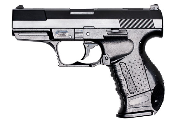
Start with good black and white image that you want to wrap that has lots of contrast:

Then do a “save as” of that image as a photoshop PSD file. You are going to need it later so remember where you saved it!
TIP: give the above image a slight bit of blur with the blur filter so the edges appear smooth when you apply the later effect. You can try it first without it and if it looks too choppy try this method again with the blur.
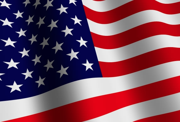
Then find a flag. This is what I chose:
Paste that image in it’s own later above the gun so you now have two layers. One with the gun and one without.
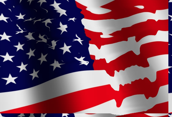
Select the layer with the flag above the gun and go to Filter > Distort > Displace
I chose the default 10 and 10 for the shift and “Stretch to fit” and “wrap around” for the other two radio buttons.
This will make it look all wiggly but its still does not look quite right:
Select white area around the gun layer and then inverse to delete the areas of the flag you don’t want.
Here is the magic part where you can really see how it wraps around the object…
Select the flag layer and then from the drop down menu select “Overlay” for the blend mode.
That is basically it! All that is left is playing with the gray tones and levels to get things looking the way you want it. This same technique can be used to apply a fake tattoo to a model, “paint” a graphic on a building, put a logo on a package or make a fake road sign. The possibilities are endless!


Leave a Reply