Easy wordle fun!

Make your custom text cloud

Today I stumbled on a fun little site called wordle and the concept is simple. You just paste in a bunch of text and hit generate. After that you can choose a color scheme, pick a font and delete words you don’t like. If you don’t like what it makes you can hit randomize and change settings for an infinite number of possibilities. Below I pasted in a list from our degrees and certificates page and got the tag cloud below. I took was generated and  played around in photoshop with various inverse and overlay effects to make the  banner for one of our web pages. Check out wordle and have some word fun!


Metal up your type

Metal up your type

The purpose of design is to communicate a message and therefore I believe special effects should be used only if there is a reason to use them. This means it’s probably rare that you’ll need to create metal type but as a designer you should know the concept of how to do it even if you’ll only do it once in your career.

Above is an image of a banner I did for our college website to congratulate one of our star alumni who played in the Superbowl. To match the emblem for the Superbowl it called for some silver type.

In addition to that I needed to remind students it was time to submit their applications for graduation. Both were going to be shown on the same page so I thought the gold and silver would compliment each other and contribute to the overall message that each was trying to convey.

Below are the settings I used in Adobe Photoshop CS5 to get both the gold and silver effect. You’ll have to vary it a little depending on your type face and point size. This will just give you and idea so you know how to shape the metal to your specifications!

Silver type

Type something. It doesn’t really matter the color or the type but in the case above I used Trajan and black but you can use any color. Then click on the layer style effects at the bottom of the layers palette and apply the settings for the various blending options:

For Gold type just add a gradient overlay for the gold color:

The color I used here is #cfa51a and #fff6b8 for the light color


Tangerine Tango Sunrise?

Apparently every year Pantone (the world authority on color) picks a color. For 2012 it’s Tangerine Tango (Pantone 17-1463). You can download the color palette from their website.

I was a bit intrigued by the color choice for this year and realized they might be right. I have been leaning towards warm charged colors for a little while now. I wondered what would have happen if I did a little color overlay on a sunrise I recently took. Below is the that tangerine tango overlay and here is a link to the original. It’s a subtle difference but see what you think!

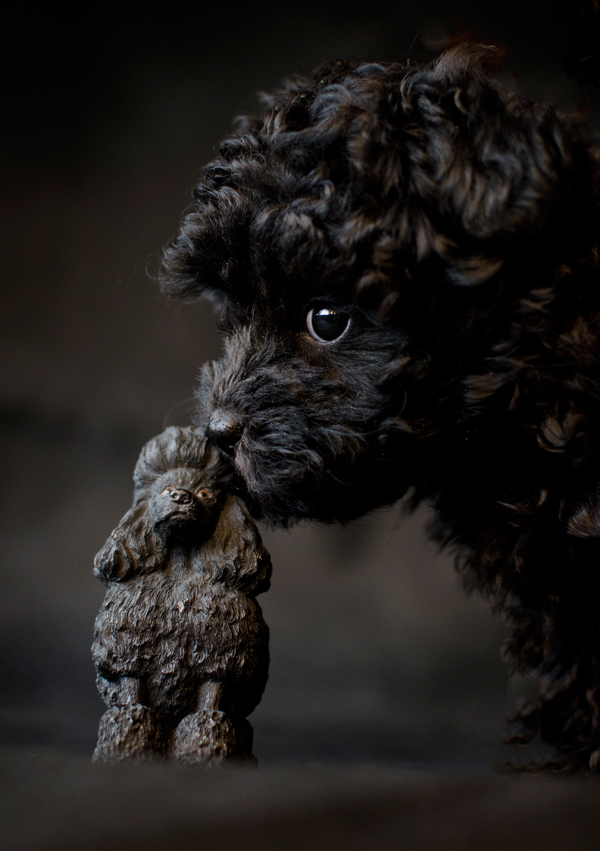
Poodle in black

Poodle in black

I just couldn’t pick a favorite so here they all are. I got a chance to photograph a pup of a different color this weekend and I have to say it was a little bit of a challenge. Her fur is inky black so I chose to photograph her against black and let the light from the window create highlights on her fur that would define her shape. For the most part I think it worked. Help me pick a favorite?


New camera & Pomegranites

Oh did I have sooooo much fun today playing with my new toy, a Nikon D7000! WOW – this is sure a step up from my D200. I have never been able to hand hold my camera and take pictures in such low window lighting like you see below. If you scroll to the bottom you will see my first video I shot as well with it. Not sure how much video I will do but it’s sure neat to have the capability to record in such low light. More images to come!

split from the rain
pretty pinks and reds


split from the rain


Where it ended up

A little impromptu video on how to cut a pomegranate and my dog Burt eating leaves taken with the D7000.