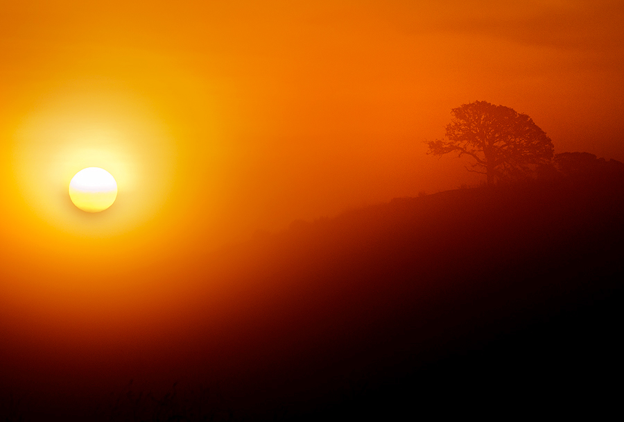
Apparently every year Pantone (the world authority on color) picks a color. For 2012 it’s Tangerine Tango (Pantone 17-1463). You can download the color palette from their website.
I was a bit intrigued by the color choice for this year and realized they might be right. I have been leaning towards warm charged colors for a little while now. I wondered what would have happen if I did a little color overlay on a sunrise I recently took. Below is the that tangerine tango overlay and here is a link to the original. It’s a subtle difference but see what you think!

Leave a Reply