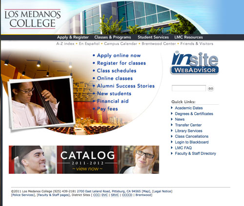
I’m excited to be able to show a sneak peak of my colleges new website due to go live on Tuesday! I originally revamped the site in 2003 and it was good for the time but then the content outgrew itself. This new launch was a year in the making with the first half of the year doing nothing but usability testing with our various audience profiles with several different navigation structures. You can read about the process of the usability study here. The main goal was to have a website that was easy to find information and still provided a rich user experience.
Below is a screen capture of our old site. It’s wasn’t even our school colors but the main problem with it was the navigation. The navigation was figured out by a committee in upper management and never really tested with the actual people who would be using the site. You will see that we have “student services” and “student resources” as two major buttons. These two buttons lead to confusion on the part of the student wondering where the information would be located. The question pops up in their head as to what is the difference? To those in academia though student services is considered a department and under it are various services that report to student service managers and deans. This is a problem when listing things under that heading because the managers then say that doesn’t fall under student services when to a student it clearly is a service. By renaming this headings and taking out the term student services all together and just defining a group of users we solved that problem.
Old site

For the new site I created beta versions and I conducted tests on groups of faculty and staff, on managers and on current students. I then conducted tests on multible feeder highs schools throughout the area that might be potential students so see if they could find the information they needed. Great care had to be given that I didn’t lead them when asking questions as they navigated through the site.
Once all the testing was done and data was tallied and suggested changes were made it was a process of converting thousands of pages through out the site. The original site was created in CSS and HTML but not in a way that it was easy to swap so many pages needed to be manually generated. During this time a little house keeping was also in order to make friendlier URLs where the web address was just shorter and more intuitive. Not an easy task since I had to find where all the possible link references for readdressing might be. I manage about 40 user connections to the college site so in addition to changing content I needed to keep track of content that is being changed without my knowledge.
Never-the-less below is a screen shot of the new sites home. Most of the large display graphics rotate and change on reload so you’ll get something different each time. There is more real estate for news and events in effort to keep the site fresh. You can view the live site here.
New site

One of the things I am most proud of is being able to deal with an enormous amount of information that is both an improvement to the navigation of the site but is also a menu system that is ADA compliant (something colleges and government sites have to worry about) and is approved in usability testing. The menu system is called “mega menus” that many large scale sites are deploying because you can organize content in categories much like you would in a grocery store where content is grouped in isles for an easier fine.
In addition to the pages with grouped information specific audiences they don’t have to leave the page they are on if they didn’t find what they need there. All they have to do is hover over the other buttons and .5 seconds (enough to determine they meant to hover) a menu will appear giving them an idea of what content is there. This is called “hover intent” and it allows the user to quickly scan the site without having to leave the page they are on. web users can see this navigation on every page of the college website.
The rest of the site is full of college specific information so nothing very showy but I do like the page with the maps and also the development of our college success stories.
The map before was a flat map that didn’t give you a sense of scale. By making it more in perspective it is easier to see where things are in relation to each other. I used zoomify in photoshop so that the user can zoom in on certain areas of the map to see detail

The student success page features a jquery/CSS based slider of the newest success stories. I wanted to stay away from flash since many of our students access our site from mobile devices.

A real effort was made to have almost all pages have a uniform look throughout the site. Many sites do a redesign but it doesn’t go past the first top level pages. We didn’t want to launch until all pages of the site looked like they belonged.


Fabulous job on this, Eloine. Something to be very proud of! Bet it feels good to be at this stage after all that work. 😉