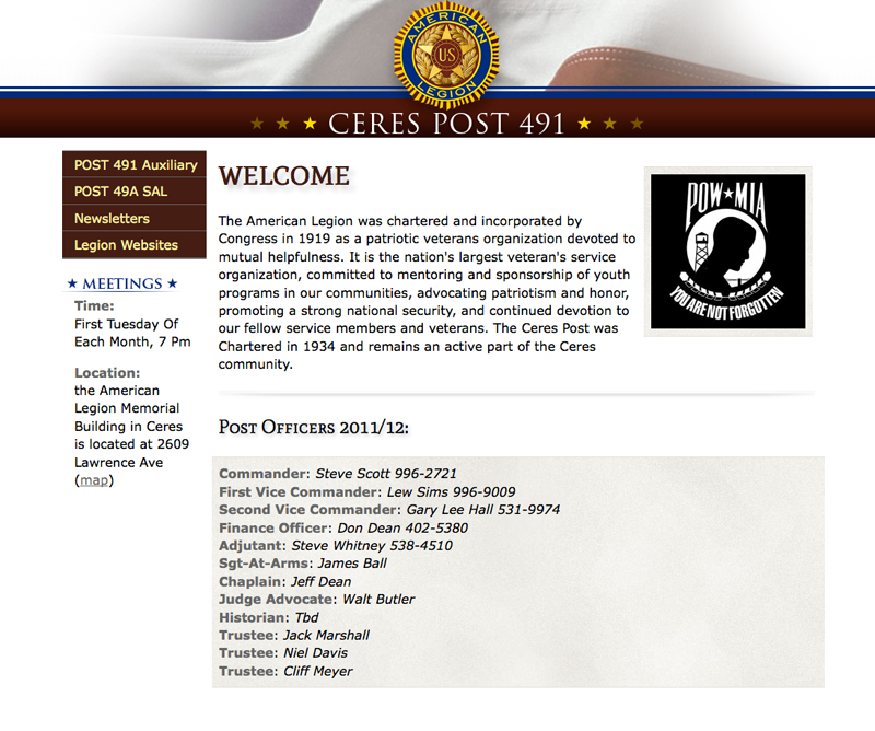
This week I did a little work for a local post of the American Legion Post 491. I am in the beginning stages with the client but thought appropriate to talk about right before Veterans Day tomorrow. This is the first time I have actually used Google web fonts. The welcome red header on this page and the subhead (H2) is provided by google web fonts. They have a pretty large variety of fonts you can choose from. I wanted to go this route because I wanted to match as close as possible the image header on the top of the page and yet still make this site so someone else can edit the text without needing to update an image file.

The font I was trying to match was Trajan and the closest I could find was Mate SC on google. It’s pretty simple browse their collection and then to copy the code and add it to your style sheet. I then added a little bit of drop shadow in CSS and transformed it to upper case for the H1 and regular for H1 through H6 for the rest.
The way you add a shadow in CSS is this little line of code:
text-shadow: 4px 4px 4px #CCC;
The first number is the X-offset, the second is the Y-offset, the third is the amount of blur for the shadow and the last three letters with the pound symbol is the color of the shadow.
I have found that the text shadow doesn’t work in all browsers. It just doesn’t show so at least it degrades nicely and doesn’t render it unreadable.
Hope to use Google fonts and CSS font styling more!
Leave a Reply