Category: Design Tips
-
Another year!
Always fun to make a new calendar for my parents business. They hand these little calendars out each year and it’s a magnet. It’s always a challenge to get all the months into a small space and still have room for contact information. I especially like this circle format. I am reminded of the a…
-

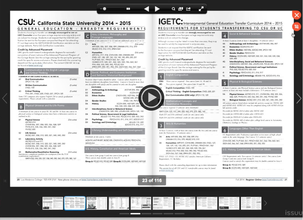
How to clip a section in a flip book
I’ve been a fan of ISSUU for a pretty long time. Besides the fact it sounds like you are sneezing when you say their name it’s a pretty easy and relatively low cost option for embedding printed documents in your website and adding some interactivity. Sometimes you just have to present information exactly as it…
-
The black and white challenge
A friend of mine recently challenged me to post a black and white photo every day for 5 days. I figured 5 days wasn’t too bad so this is what I posted and this is what I learned When I started out on the rainbow image I used Silver Efex Pro which has some “recipes”…
-
My iPad painting attempt
This is not really my first iPad painting but it’s the first one I’ve done that I actually like! I wish I could say I imagined the scene but I used my friends photo of a fire access road in Oregon for inspiration. He said the light on the road broke through the mist and…
-
To be 19 feet tall!
It’s always fun to see your images being used but it’s not often they are 19 feet high!
-
Link to a page in a multi-page PDF
Do you have a muliti-page PDF that you would like to post on your website and keep that way but also want to link to a specific page number in the PDF? The quickest and easiest way is to just append the page number to the end of your web address like this: #page=<pagenum> When…
-
Frosting a building in photoshop
I was asked to make a little holiday card for work where one of the buildings would be frosted. We don’t get frost like this so that’s why it’s a little funny. Many asked me how I did it. I used several photoshop tricks in combination with fine tuning some of those tricks for this…