Link to a page in a multi-page PDF

Do you have a muliti-page PDF that you would like to post on your website and keep that way but also want to link to a specific page number in the PDF? The quickest and easiest way is to just append the page number to the end of your web address like this: #page=<pagenum> When you click on the link below you will automatically go to page 29 of this document.

EX: http://www.losmedanos.edu/PDFs/crisisinterventionmanual.pdf#page=29

See more parameters at the Adobe website

If you want me to share more tips like this let me know if the comment section below!


Frosting a building in photoshop

I was asked to make a little holiday card for work where one of the buildings would be frosted. We don’t get frost like this so that’s why it’s a little funny. Many asked me how I did it. I used several photoshop tricks in combination with fine tuning some of those tricks for this particular image. Below is the original I started with followed by the final image.

frostyex

Read more

Symbiotic Flow

postcards

What we have here is a art piece for a show with unusual concept on what is means to be a terrestrial being. I thought about this for a while before I chose my subject. Anyone who knows me knows that water has always been a battle. We lived in the country when I was very young and without a well. It was hard to get water so I learned early an appreciation for water conservation. Later we have a well but the water is high in minerals that the plants in my garden don’t like so water treatment is a must. Without water all things living will die so it’s impossible to live without.

When we send missions into space to explore other planets the water is the first thing we look for or some sign that it was there. We don’t look for gold or silver first – it’s always water because that is what can support life as we know it. Hence my photo so freely letting the water flow. To the left I overlay the lack of water and to the right I overlay the life it brings. It may be aquatic versus terrestrial but without the aquatic the terrestrial life can not be.

Symbiotic Flow
Symbiotic Flow

Read more

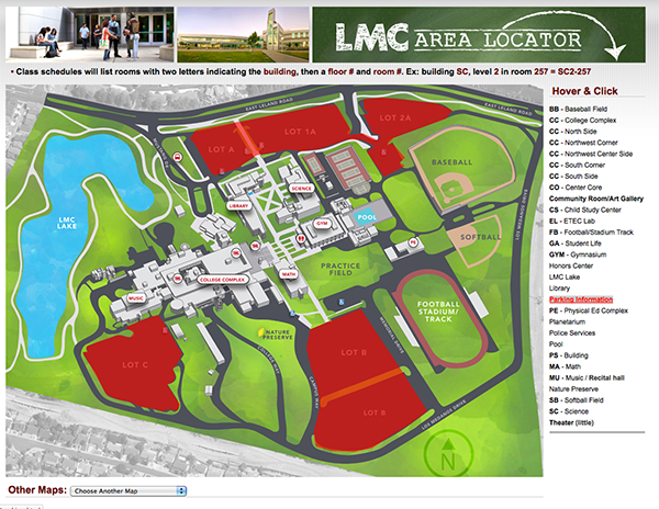
Design process for building an interactive map

Design process for building an interactive map

This isn’t really a tutorial of how to create an interactive map as this blog post would be way too long and too complex. It’s more about the process of taking various resources and putting them together to create something. As I write this post this map is a work in progress. View Demo

The first step was to create the map. This was mostly done taking a screen grab from a satellite view of our campus off of Google maps. Then the buildings were traced using the pen too for each panel and curve. Shading was applied to give the buildings a 3D look.

header

For masthead where the text looks like chalkboard type I used the rough texture of paper overlay into white type. I then outlined the type and the arrow that I drew with a rough brush.

The map below is using several different technologies.

  • Image maps to make hot regions using Adobe Dreamweaver to define the coordinates on mouse hover.

map1 Read more

Earth day graphics

Just sharing a couple graphics that I made recently for the upcoming earth day on April 22nd. One is for a plant sale and another is an awareness event put on my a sustainability committee. I used some clip are and did a lot merging.

The font I used for the writing on the pot is called “chalkboard” Kinda obvious huh?

For the image below I used puppet warp to get the ground to wrap around the earth and spherized filter to bloat the text a little. I made a selection of the text on the earth and then inverted the colors and overlaid the green color. There is kind of a dark quality to it that I think tells a little story about earth day or consequences of not caring about the earth.


earthday1

Flag wrapped gun with displace filter

Flag wrapped gun with displace filter

Ok so this is not my usual cute little fluffy kitten or flowers photo. I assure you there are more of those to come!

For now the pressing issue of the day seems to be guns and violence. Not making a stand either way on that issue but as a graphic designer you have to illustrate anything. Here is a little web banner I had to whip out for a college debate on the subject.

My idea was rather typical but often typical gets the point across of what is really at the heart of the issue: the constitution and our rights as US citizens. What better symbols than a gun (duh!), the constitution and the US flag?

I could have just made a collage of all three symbols but just to make it a little more eye catching I decided to merge the two with a very old Photoshop trick.

I still don’t know a better way to do this but if you do please feel free to share. For now though here is how I do it using the displace filter.

Start with good black and white image that you want to wrap that has lots of contrast: Read more