Ok… So my tomatoes weren’t perfect this year but at least they have some character!
Featured
Colorful mulch alternative
About 5 years ago I got a chance to visit Glass Beach and try my hand at hunting for different colored glass.
Glass Beach is one of the most unique beaches in the world, not because nature created it that way, but because time and the pounding surf have corrected one of man’s mistakes.
Beginning in 1949, the area around Glass Beach became a public dump. It is hard to believe these days, but back then people dumped all kinds of refuse straight into the ocean, including old cars, and their household garbage, which of course included lots of glass. Finally in 1967, the North Coast Water Quality Board realized what a mistake it was and plans were begun for a new dump away from the ocean.
Now, over 30 years later, Mother Nature has reclaimed this beach. Years of pounding wave action have deposited tons of polished glass onto the beach. Every day people come to hunt what old bits of treasure wash to shore. You’ll still see the occasional reminder of it earlier life, such as a rusted spark plug, but for the most part what you’ll see is millions of pieces of glass sparkling in the sun.
I came home with several bags full but after gathering all these bags of different colored glass the question remained as what do I do with this pretty but unusable stuff???
So in storage for 5 years it sat until I had an idea for a use today. My little old lady cactus was getting a bunch of weeds around her. I was going to put some boring old bark around her when I remembered the white colored glass I had collected from Glass beach. The old lady cactus has such a soft blueish white appearance to her that I thought the colored glass would look so nice around her base. To add a little interest I added some blue glass pebbles from my fish tank.
Currently this cactus is not in bloom but it has reddish pink flowers that grow in a crown long the top. I think the blue will set this off nicely.
I almost put some of my clear glass pebble but soon realized it magnifies the suns rays and could burn the plant. The glass from glass beach is tumbled though so it’s almost opaque with a natural etching from the tumbling process on the beach.
So there is my gardening tip. You don’t have to stick to just what the garden store sells. Recycle even if it’s many many years later!!
Below are three pictures of the cactus outside in my garden and then a couple more where I brought the cactus into my studio and played with the side lighting a little…
A Little King
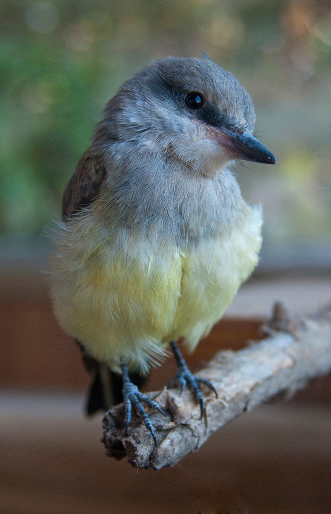
This is a young Western King bird that I found one day on the ground in the evening hours. I thought it just couldn’t figure out how to fly yet and had fallen out of the nest. The nest was atop a high tree so there was no way to put it back. Our cats and peacocks were ready to eat it right there so I took it in for the night hoping to release it in the morning where I knew it’s parents were. Unfortunately it was then I I found out upon closer inspection that he was missing all of one wing and would never ever have a chance of getting off the ground. I didn’t appear to be a fresh wound since it was otherwise healthy. It was then I found out I had a little king in my life!
Little King now had a king sized mansion with all perches and branches at various angles so he can hop from branch to branch. Here he is sitting on his perch in my studio. Some are shot against a white background with just window lighting and a reflector and others are shot with a shoot through umbrella and an SB600 opposite the window. The images with trees in the background were seen through a side window.
Bouncing a grape
Taking a bath
College website gets a makeover
I’m excited to be able to show a sneak peak of my colleges new website due to go live on Tuesday! I originally revamped the site in 2003 and it was good for the time but then the content outgrew itself. This new launch was a year in the making with the first half of the year doing nothing but usability testing with our various audience profiles with several different navigation structures. You can read about the process of the usability study here. The main goal was to have a website that was easy to find information and still provided a rich user experience.
Below is a screen capture of our old site. It’s wasn’t even our school colors but the main problem with it was the navigation. The navigation was figured out by a committee in upper management and never really tested with the actual people who would be using the site. You will see that we have “student services” and “student resources” as two major buttons. These two buttons lead to confusion on the part of the student wondering where the information would be located. The question pops up in their head as to what is the difference? To those in academia though student services is considered a department and under it are various services that report to student service managers and deans. This is a problem when listing things under that heading because the managers then say that doesn’t fall under student services when to a student it clearly is a service. By renaming this headings and taking out the term student services all together and just defining a group of users we solved that problem.
Old site
For the new site I created beta versions and I conducted tests on groups of faculty and staff, on managers and on current students. I then conducted tests on multible feeder highs schools throughout the area that might be potential students so see if they could find the information they needed. Great care had to be given that I didn’t lead them when asking questions as they navigated through the site.
Once all the testing was done and data was tallied and suggested changes were made it was a process of converting thousands of pages through out the site. The original site was created in CSS and HTML but not in a way that it was easy to swap so many pages needed to be manually generated. During this time a little house keeping was also in order to make friendlier URLs where the web address was just shorter and more intuitive. Not an easy task since I had to find where all the possible link references for readdressing might be. I manage about 40 user connections to the college site so in addition to changing content I needed to keep track of content that is being changed without my knowledge.
Never-the-less below is a screen shot of the new sites home. Most of the large display graphics rotate and change on reload so you’ll get something different each time. There is more real estate for news and events in effort to keep the site fresh. You can view the live site here.
New site
One of the things I am most proud of is being able to deal with an enormous amount of information that is both an improvement to the navigation of the site but is also a menu system that is ADA compliant (something colleges and government sites have to worry about) and is approved in usability testing. The menu system is called “mega menus” that many large scale sites are deploying because you can organize content in categories much like you would in a grocery store where content is grouped in isles for an easier fine.
In addition to the pages with grouped information specific audiences they don’t have to leave the page they are on if they didn’t find what they need there. All they have to do is hover over the other buttons and .5 seconds (enough to determine they meant to hover) a menu will appear giving them an idea of what content is there. This is called “hover intent” and it allows the user to quickly scan the site without having to leave the page they are on. web users can see this navigation on every page of the college website.
The rest of the site is full of college specific information so nothing very showy but I do like the page with the maps and also the development of our college success stories.
The map before was a flat map that didn’t give you a sense of scale. By making it more in perspective it is easier to see where things are in relation to each other. I used zoomify in photoshop so that the user can zoom in on certain areas of the map to see detail
The student success page features a jquery/CSS based slider of the newest success stories. I wanted to stay away from flash since many of our students access our site from mobile devices.
A real effort was made to have almost all pages have a uniform look throughout the site. Many sites do a redesign but it doesn’t go past the first top level pages. We didn’t want to launch until all pages of the site looked like they belonged.
Getting ready!
My pretty sunflower
Ok anyone who knows me knows I like sunflowers. It’s hard to capture what’s magical about them. Maybe it’s just this giant glowing face staring back at me that is almost the same size as my head. The glowing color seems to fill my eyes with sunshine yet it doesn’t hurt to look at. Anyway, whatever it is I love this time of year when my sunflowers open and I get to watch the pollen circle it’s way around the center in concentric rings.
This photo is actually two shots. I lit if from behind and then I lit it from the front to highlight the center and then combined the two. The purpose was to try and capture that glowing nature that always attracts me to sunflowers.
UPDATE: Well as with all good things they come to an end and so did my sunflower. He had a long life standing on the kitchen sink but eventually he drooped his head and went to sleep. He then gave me his petals and it made a nice healthy topping on my roasted chicken with home grown dill and boiled swiss chard 🙂
Sunflower petals have a slight nutty flavor so it’s perfect sprinkled over salads or chicken. When tossed in with salads the color ads quite a flare. In addition they are a great antioxidant and have anti-inflammatory properties.