Category: design
-

Useful web resources for web designers
In this posts are some web resources that I will be adding to for my Art 058 course on Designing for the Web Using Adobe Dreamweaver CC at Los Medanos College in the Fall of 2016. (Search for the course here in the Fall 2016 schedule) When designing for the web there are many tools…
-

Nifty QR Code
Ever see those ugly black and white things that were all the rage a few years back called QR codes? Well they had the potential of being something great but they were pretty ugly and the technology just wasn’t on everybody’s phone to make it that useful. I discovered ounchtag.com today and made my own QR…
-

Design process for building an interactive map
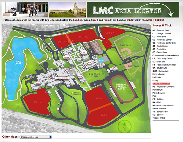
This isn’t really a tutorial of how to create an interactive map as this blog post would be way too long and too complex. It’s more about the process of taking various resources and putting them together to create something. As I write this post this map is a work in progress. View Demo The…
-

Flag wrapped gun with displace filter
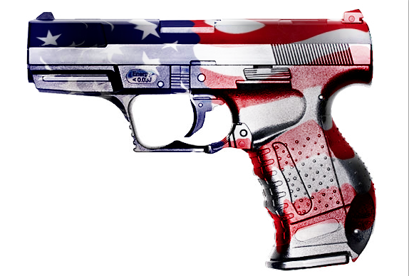
Ok so this is not my usual cute little fluffy kitten or flowers photo. I assure you there are more of those to come! For now the pressing issue of the day seems to be guns and violence. Not making a stand either way on that issue but as a graphic designer you have to…