I just learned about this really simple free tool from a post on WPfixit.
All you have to do is type in your URL and just like magic it shows you various screen sizes. You can even use them as little browsers to get the view you want. You can turn on and off the various views and move them around as you see fit for presentation.
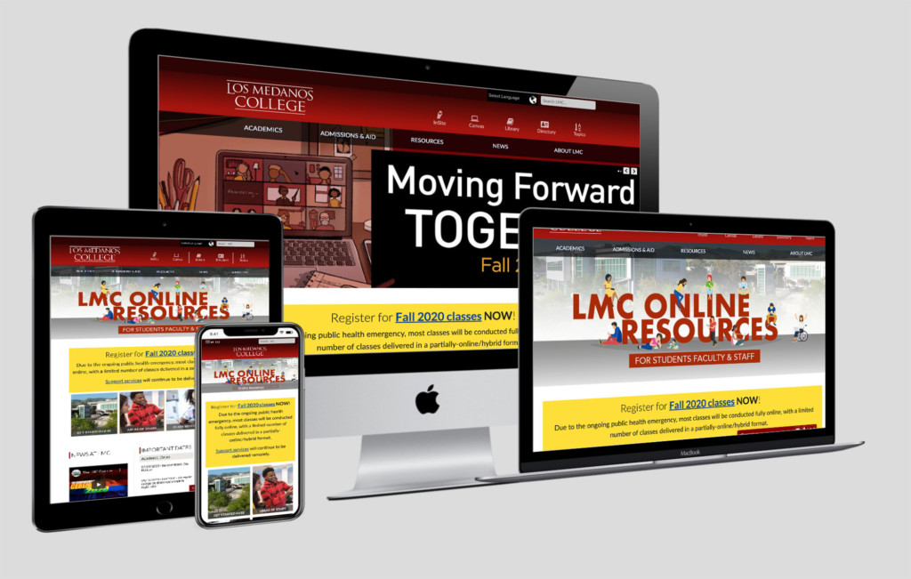
In addition you can change the background screen and and the angle of the presentation as well.
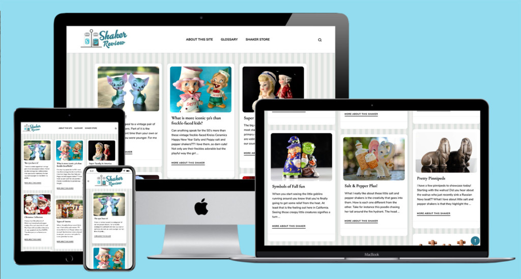
What is even more fun is once you get the view you like you can take a screen shot and now you have a comp to show your client.
It’s a lot easier than having to take screen shots of each view and assembling each on in a device representation! Visit Techsini.com to try it out.
Leave a Reply