Sweeney’s web image

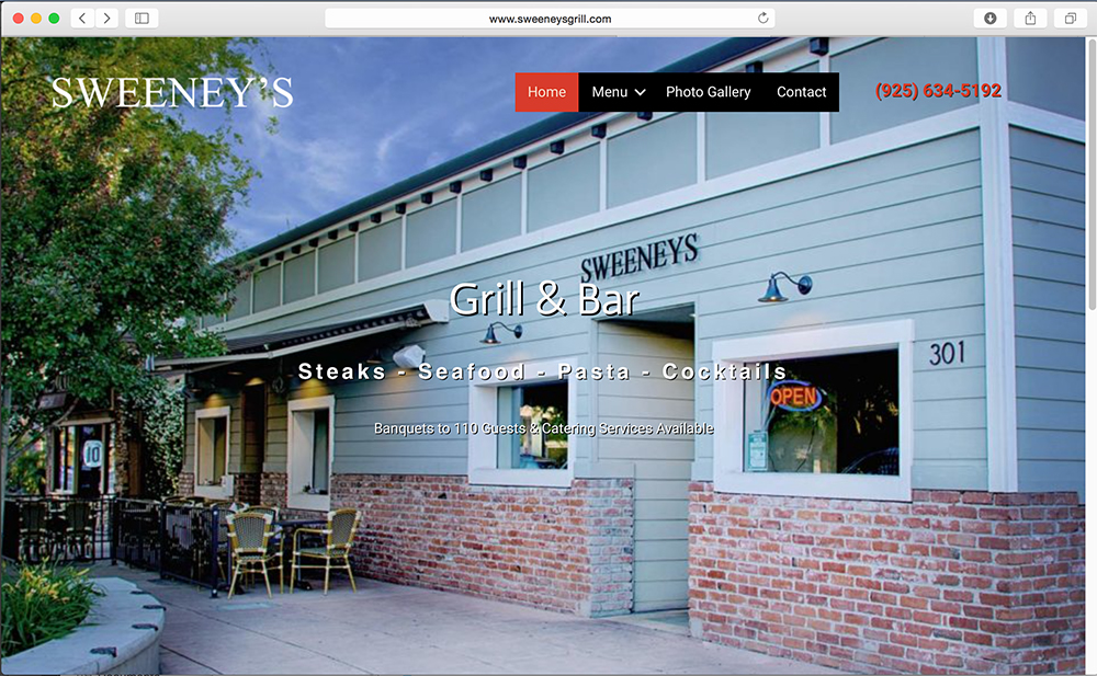
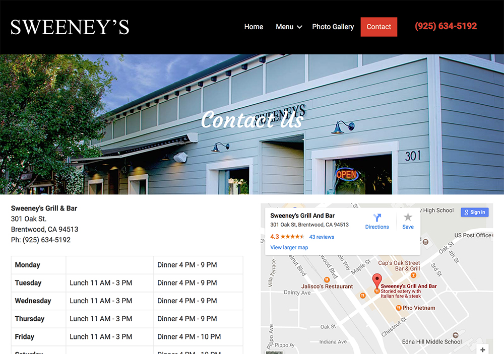
I was asked to take a photograph of a local restaurant in my area, Sweeney’s Bar and Grill. Little did I know this building was close to 100 years old. I shot in the evening so I could get a little light from the open sign and under the awning with some nice clouds in the sky. They recently updated their website and I think the picture worked out well.
2 thoughts on “Sweeney’s web image

  • June 1, 2017 at 4:40 pm
    Permalink

    The photo is great. Exposure is spot on and the perspective and placement of elements is perfect. Not a thing I can say negative. Great job!

    Now, something that bugs me. You said they updated the website, and I assume it’s HTML or CSS that controls the placement of words over the photo. Maybe it’s just a pet peeve with me, but it bothers that “Contact” is on top of the name Sweeneys. And to a lesser degree where “Grill & Bar” is placed. IMHO, the name should be clear and unobstructed. Yes, it says Sweeneys prominently elsewhere on the pages, but I’d still like to see it in the clear on the building. Maybe no one else would notice and I am just weird, but that’s what jumped out at me.

  • June 1, 2017 at 5:01 pm
    Permalink

    I agree that that name could be more prominent and that the text over the image is hard to read in the screen shot. If you go to the website you will see the designer did a Ken Burns type effect so the name on the building isn’t overlapped. It also fades into another image so that helps. I will pass on the feedback though.

Leave a Reply

Your email address will not be published. Required fields are marked *

This site uses Akismet to reduce spam. Learn how your comment data is processed.