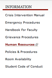
I’m currently putting together a fairly large site for a college that has “mega list”. I will post more about that in another posts but basically mega lists allows you to see columns of information all at once. It’s different from an old style drop down menu in that items are broken up into categories of content much like you would see categories in a supermarket. It helps people to scan the categories in a store and think about which isle they might find something.

Another helper in making websites more usable is to standardize icons and visual cues to let readers know what will happen when they click on a link. What I have been seeing more and more of lately is icons that let a reader know they are going somewhere else other than your website to get the information they need. The importance of this is that your navigation and style may be drastically different than where you are sending them. For example in the sliced view of the mega list to the right I am working on you can see as I hover over the words “human resources” there is a little square icon to the right of the words. This gives a visual cue that information for this topic is not housed on this site. In this case it’s housed at the district office where information can be somewhat buried. The user can make a mental note before they click the link that they are going to be sent off somewhere else to look for the information they seek.
So far there is no one standard icon that web developers use that I have found but what does seem to be consistent is that it’s a little square the size of your font with a little arrow that points up and to the right to signify off-site. The more this icon is used by web developers the more the general public will know what the meaning of this image is.
Some examples that you may download and use: 


You could just add this to any link that is off-site manually but with a little CSS you can add it automatically.
#main a[href^=”http://”] {
background: url(external.png) center right no-repeat;
padding-right: 13px;
}
What this says above the any HREF tag in the main area of the website that begins with http should use this external icon to the right of the link and the pixel width of the icon plus a little space.
This is fine if all my links are relative where one links points to this file name and that file name however sometimes for various reasons the full URL is inserted and therefor anything with the full absolute URL – even to your own site is going to show the off-site link. How pointless!
So to make it so not every absolute link shows you need to add this after the above code to get rid of the icon for anything that has your domain in the URL.
#main a[href^=”http://www.yourdomain.com”] {
background: none;
padding-right: 0;
}
I have tested this in all the major browsers on both Mac and PC but noticed that it does not work on IE 6. The only thing that happens is that it doesn’t show. So they loose that extra nice thing of the modern age but if they are still using IE 6 I guess they know the limitations.
Please comment if anything is unclear!
Leave a Reply