Copyright range on your website

Copyright range on your website

Do you need a copyright symbol?

You technically don’t need a copyright to protect yourself but it is a reminder that your work is just not free for the taking and the thought is that in court it’s much harder for a person to claim they didn’t realize they couldn’t use your work if you have the copyright notice visible on your site.

One little detail that I see often overlooked is the date in the footer. People will put a copyright there with just one year – the year the site was created. But a website and especially a blog is constantly changing so therefore it should have a copyright range because all of your work is protected from the first design to the last design. Read more

How to share a youtube video fullscreen

How to share a youtube video fullscreen

It’s easy enough to click the full screen mode on a video but what if you would like to share a video already viewable in the large size? Perhaps you want to embed a link on your web site that doesn’t show all the other youtube clutter? You just want the video to take over the view. Not sure why youtube has hidden this but for now the solution below seems to work.

The URL for a video you find on youtube for example looks like this:

https://www.youtube.com/watch?v=r0eHPrT_Wjo

This is just going to show you something that looks like this:

Screen Shot 2015-06-24 at 11.34.57 AM

The trick to get full screen is to delete “watch?v=” and replace that with “v/

Below is the changed web link. Copy and paste the link below in the browser to test!

https://www.youtube.com/v/r0eHPrT_Wjo


Stained Glass Illustration

Stained Glass Illustration

glass4blog

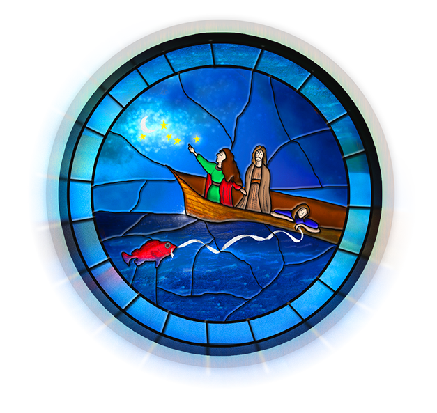
I was asked to take this pencil illustration (see art here) and create a graphic for a poster that will advertise a newly written opera. I’m not much of an illustrator myself but I at least had the pencil sketch from the client to work off of. I used Adobe Illustrator to outline and ink in the illustration and then photoshop to apply textures.

The name of the opera is the Voyage of Mary Magdalene. You can view the hatchfund project and see a video about the opera here. It will be opening March 21st at the Clayton Valley Presbyterian Church.

Since the play was biblical in nature I thought stained glass would be appropriate and also would explain the blocky chunks of color. I chose to follow this tutorial which was a perfect choice!!


Tutorial on making a thought bubble, new card design & and a puppy

Tutorial on making a thought bubble, new card design & and a puppy

[mp_row]

[mp_span col=”12″]

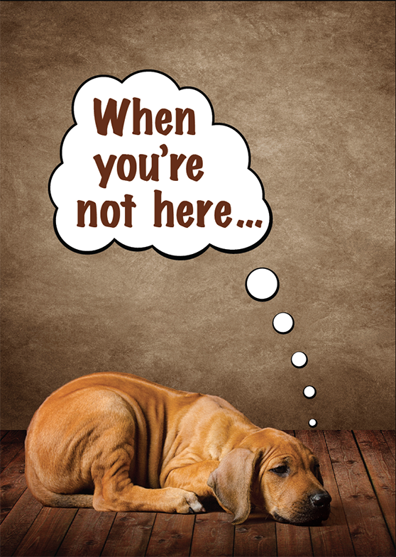
pupI recently took pictures of an adorable Rhodesian Ridgeback puppy and some of the photos have been accepted at Shutterstock.

This one of of the sad puppy pose in particular I am making into a greeting card for when you are missing someone.

The front of the card shows her as a sad little puppy with a thought bubble above her head saying “When you’re not here…” and in the inside it says, “I feel a little sad.”

I thought I would also take the time to do a quick tutorial on how to use Adobe Illustrator to make a thought bubble. There are a bazillion ways to do this but this is a nice quick and easy way I thought I would share. Read more

Animated graphic for a newsletter created in photoshop

Animated graphic for a newsletter created in photoshop

Tis the season to make little holiday graphics so I thought I would share how to make a little animated graphic you might embed in an email to encourage someone to click it.

Below is several I put together along with how to create one in photoshop. These were to encourage viewers to click through to view a video. Videos are harder to actually get to play in an email but an animated GIF usually does play. I must say the cute little  snowman below was drawn by our extremely talented intern Ali Cameron!


lights-V2 lights snowman


The first step is to design the each design that will be in sequence. The fewer the better because each frame will slow down your load time.

Using the first graphic as an example there is only two frames. One with one set of lights on and then the other with the alternating lights on.


1. Create the graphic along with the layers that will include the graphics for each frame.

2. Select window>timeline. If asked choose animation for graphic instead of animation for video.

3. The first frame will already be visible. Select the duplicate frame icon.
Screen Shot 2014-12-12 at 12.00.38 PM

4. Now turn on and off the visible layers to show what the next frame will look like.

5. Select how long you want each frame to display and if you want to the animation to loop forever.

6. Select file>save for web  and choose GIF as your file type!

How to clip a section in a flip book

How to clip a section in a flip book

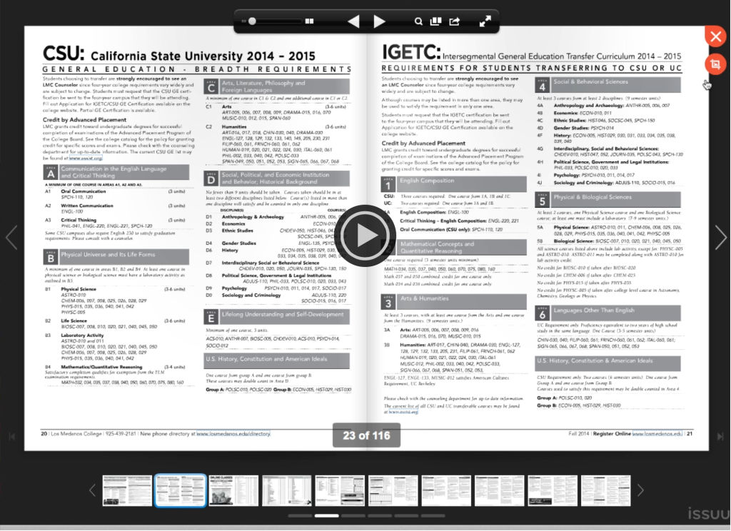
I’ve been a fan of ISSUU for a pretty long time. Besides the fact it sounds like you are sneezing when you say their name it’s a pretty easy and relatively low cost option for embedding printed documents in your website and adding some interactivity. Sometimes you just have to present information exactly as it was laid out in a print layout program and ISSUU does this.

Sometimes all you need is just one page or a section of a page within a pretty large document to share with someone. ISSUU recently released that feature and I think it’s pretty useful! I recorded a little video that shows this.

Screen Shot 2014-11-07 at 5.41.30 PM

Design process for building an interactive map

Design process for building an interactive map

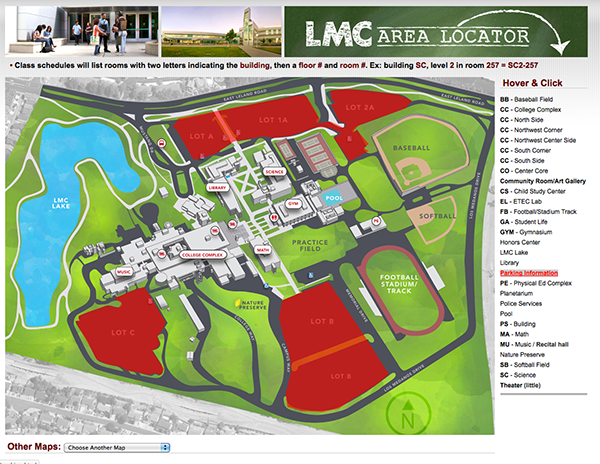
This isn’t really a tutorial of how to create an interactive map as this blog post would be way too long and too complex. It’s more about the process of taking various resources and putting them together to create something. As I write this post this map is a work in progress. View Demo

The first step was to create the map. This was mostly done taking a screen grab from a satellite view of our campus off of Google maps. Then the buildings were traced using the pen too for each panel and curve. Shading was applied to give the buildings a 3D look.

header

For masthead where the text looks like chalkboard type I used the rough texture of paper overlay into white type. I then outlined the type and the arrow that I drew with a rough brush.

The map below is using several different technologies.

  • Image maps to make hot regions using Adobe Dreamweaver to define the coordinates on mouse hover.

map1 Read more