Web page count tip

Sometimes the seemingly simplest question is the hardest to answer!

There are times when you just want to know how many web pages are on a domain. It would be easy just to give a total of the number of files on the sever however that tells you the number total of all the images, web pages and other documents. If you just want to know how many web pages there are here is a little trick I learned.

  1. Go to google.com on a desktop machine. Didn’t seem to work on my iPad
  2. Type in site:www.yourdomain.com (change “yourdomain.com” to be yours of course!)
  3. Note the little gray numbers under the search. This is how many pages are on the site

NOTE: this is a great way to browse the content of a site that hasn’t linked to all their content or their content is buried deep in their site.

See below of an 8 page site I designed.

site1


Now look at how many pages the college site has that work for!

site2

Web store sneak peak

I don’t usually show a website until it’s mostly finished but I am excited about my new pet photo stock store I am setting up. As of this post I have only formatted 6 photos for sale because I wanted to focus on getting all the details right before adding more. I am using gumroad for the store engine and I coded the page to be responsive so hopefully when you view this on any device you can see the thumbnails fairly large in either 3, 2 or one column. Be sure to sign up for my mailing list to be alerted when I add new photos at the bottom of the page!

store

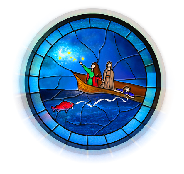
Stained Glass Illustration

Stained Glass Illustration

glass4blog

I was asked to take this pencil illustration (see art here) and create a graphic for a poster that will advertise a newly written opera. I’m not much of an illustrator myself but I at least had the pencil sketch from the client to work off of. I used Adobe Illustrator to outline and ink in the illustration and then photoshop to apply textures.

The name of the opera is the Voyage of Mary Magdalene. You can view the hatchfund project and see a video about the opera here. It will be opening March 21st at the Clayton Valley Presbyterian Church.

Since the play was biblical in nature I thought stained glass would be appropriate and also would explain the blocky chunks of color. I chose to follow this tutorial which was a perfect choice!!


Tutorial on making a thought bubble, new card design & and a puppy

Tutorial on making a thought bubble, new card design & and a puppy

[mp_row]

[mp_span col=”12″]

pupI recently took pictures of an adorable Rhodesian Ridgeback puppy and some of the photos have been accepted at Shutterstock.

This one of of the sad puppy pose in particular I am making into a greeting card for when you are missing someone.

The front of the card shows her as a sad little puppy with a thought bubble above her head saying “When you’re not here…” and in the inside it says, “I feel a little sad.”

I thought I would also take the time to do a quick tutorial on how to use Adobe Illustrator to make a thought bubble. There are a bazillion ways to do this but this is a nice quick and easy way I thought I would share. Read more

The black and white challenge

Screen Shot 2014-10-27 at 7.53.37 AM
Select the Black & White adjustment layer in the layer panel and then adjust the color sliders.

A friend of mine recently challenged me to post a black and white photo every day for 5 days. I figured 5 days wasn’t too bad so this is what I posted and this is what I learned When I started out on the rainbow image I used Silver Efex Pro which has some “recipes” for black and whites. They are pretty nice.

As I went on though I found the black and white adjustment layer of Photoshop CS6 was more than enough. Simply converting an image to black and white depending on the image can just look kinda look dull gray. The black and white adjustment layer can give your images some pop.

Once selected another panel appears where you have a choice to use one of their presets or just adjust the color sliders. The color sliders were great. In the image of the chemist he was wearing a blue shirt and as I adjusted the blue and cyan slider it went to black making some nice contrast with his white lab coat.

bw


A few career portraits

I was asked to take photograph a few career oriented portraits of our students for a set of departmental flyers. Each student would be highlighted in a flyer about the program along with a quote about what the program did for them. Below is a selection of some of the wonderful people I met.

ELC_2525-4
This is Patricia who after her job in the retail industry was downsized during the economic downturn and decided to go back to school. She is now graduating from the electrical instrumentation program.

Read more